Color is not only about making a design look attractive; it also influences emotions, strengthens branding, and guides user attention. Understanding color theory basics is essential for every designer who wants to create visually appealing and effective designs. Whether you’re working on graphic design, web design, or branding, knowing how colors interact can significantly improve your work.
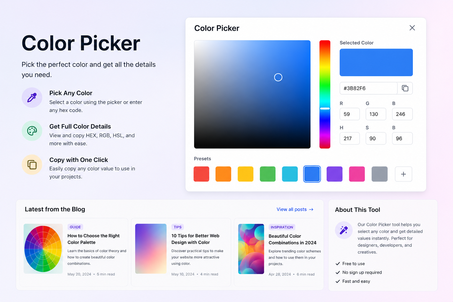
The color wheel basics form the foundation of color theory. The color wheel helps designers understand the relationships between colors. The primary colors are red, blue, and yellow. By mixing primary colors, you create secondary colors, and combining primary and secondary colors produces tertiary colors. Understanding these relationships is a key part of graphic design color theory and helps in creating balanced and attractive color combinations.
When developing a color palette design, there are several color harmony techniques that designers can use. A monochromatic color scheme uses different shades, tints, and tones of a single color. For example, various shades of blue can create a clean and professional appearance while maintaining visual consistency.
An analogous color scheme consists of colors that sit next to each other on the color wheel. These combinations often create a harmonious and comfortable design, making them popular in web and UI design projects.
Another popular approach is using complementary colors. Complementary colors are positioned opposite each other on the color wheel and create strong contrast. This technique helps important elements stand out and improves visual hierarchy within a design.
In addition to color harmony, color psychology plays a major role in design and branding. Different colors evoke different emotions and perceptions. For example, blue often represents trust and reliability, while red conveys energy and excitement. Understanding design color principles and color psychology can help designers choose the right colors for their target audience and brand message.
By mastering color theory for designers, color harmony techniques, and color psychology, you can create more effective visual experiences. A strong understanding of color relationships allows designers to build better user interfaces, stronger brands, and more engaging digital products.